FOX • Brand Evolution
UPDATE:
This project was recognized with a GOLD PROMAX Award in the category of ‘CHANNEL I IMAGE - REBRAND OR REFRESH’ as well as a Clio Entertainment Bronze Award for ‘Network/Series Identity Package’.
In the wake of the historic acquisition of the majority of FOX to Disney, I had the unique opportunity to oversee the evolution of the FOX Network Brand and Design Identity. This effort would be the most extensive brand overhaul for FOX since the network first launched in 1986.
The mission: Evolve from a traditional broadcast network into a entertainment brand. To look to the organization’s past to reimagine its future and position FOX Entertainment for future success.
I engaged the legendary design and branding studio Trollbäck+Company for the project. An intensive period of market research, internal interviews and brand strategy exploration was followed by the development of a completely new Design Identity to support all consumer-facing, industry and corporate branding needs.
The project took roughly 11 months to complete and launched in the Fall of 2019. The project successfully coalesced a new brand strategy around a re-imagined and re-energized Design Identity. As an internal Creative Director I was proud to establish a robust Design System for the company with strong foundational frameworks but with the flexibility to evolve for years to come.
Below is a look at the process...
Design & Animation

Design Theme: Deconstruction <--> Reconstruction
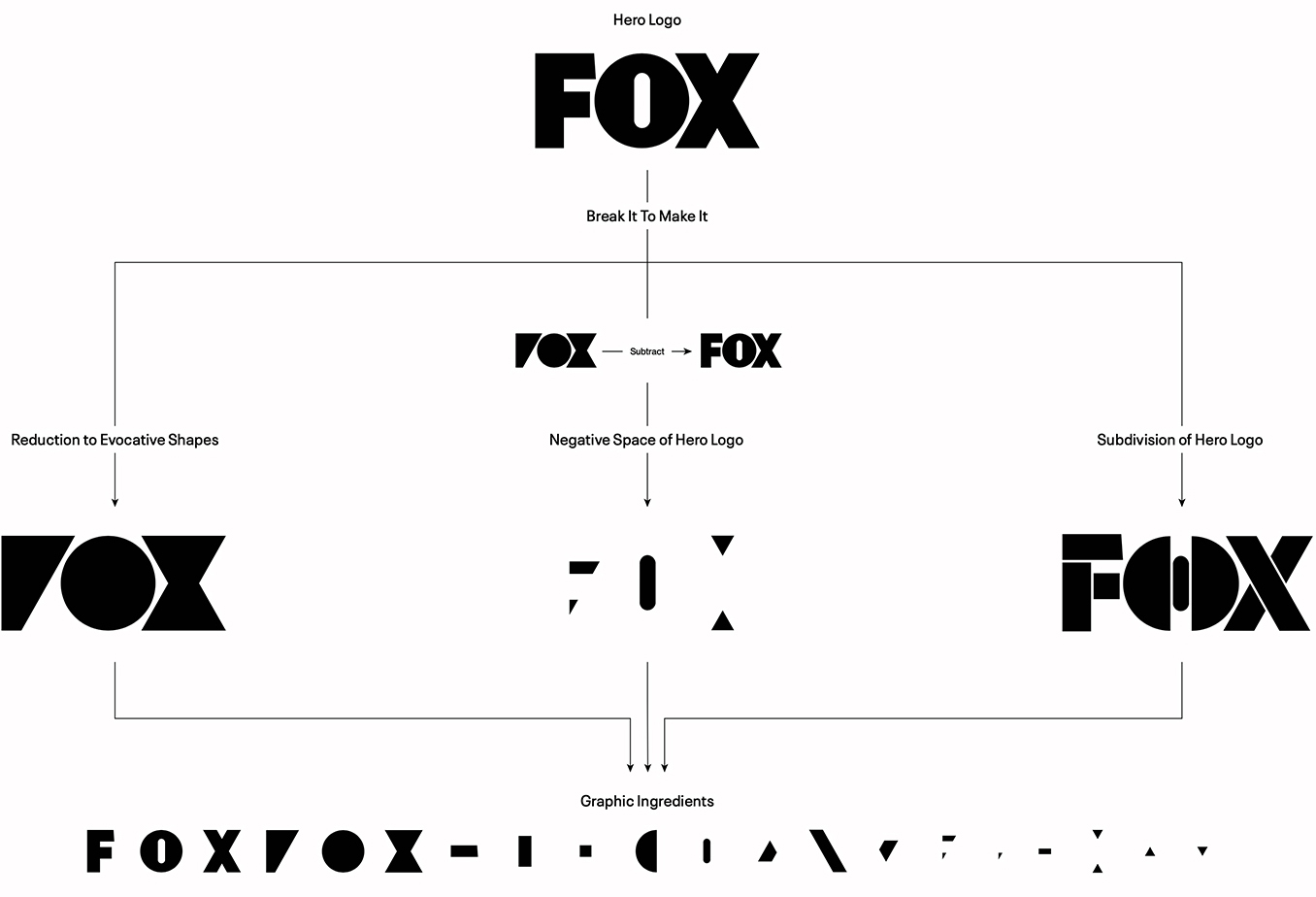
FOX thrives when breaking barriers, upending conventions, and remaking the familiar into something totally unexpected.
With that as a visual concept, we broke apart the FOX logo to create a library shapes that we could leverage into a design system.
The ultimate theme? To breaks things to make new things. And build into the DNA of our new Design Identity a spirit of adaptability that can flex and evolve endlessly.
With that as a visual concept, we broke apart the FOX logo to create a library shapes that we could leverage into a design system.
The ultimate theme? To breaks things to make new things. And build into the DNA of our new Design Identity a spirit of adaptability that can flex and evolve endlessly.
Design Theme: ‘O’ Portal
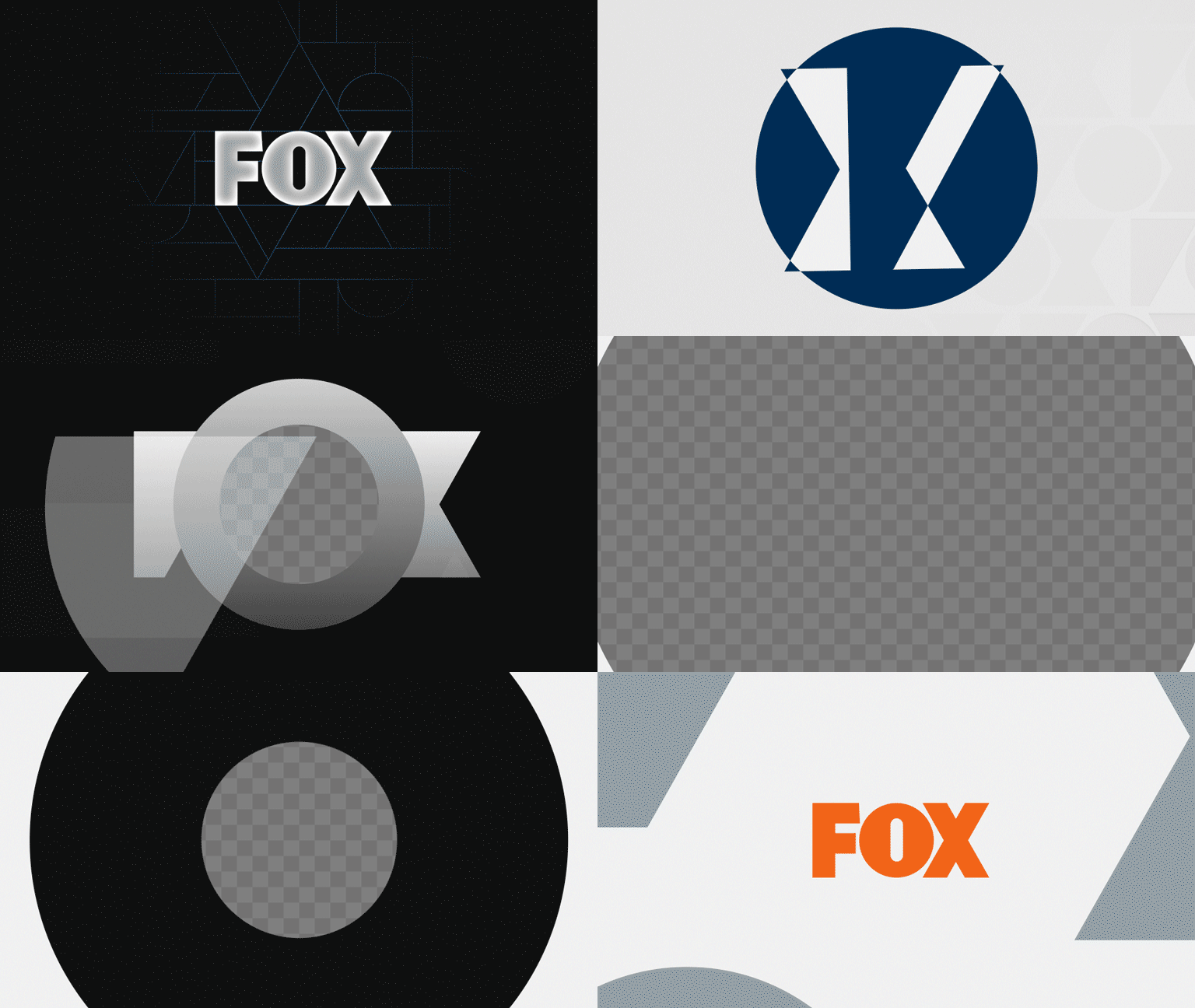
The “O” in FOX became a central element in our new brand identity.
Moving through the portal became an ownable animation device to transition in and out of footage — a promo or Instagram post, for example — to create a seamless, memorable connection between our brand and shows, our attitude and the spaces we operate in.
As a visual metaphor for FOX Entertainment, you will literally need to go through FOX to get to our content.
Animation Tone & Technique
A modern brand needs a modern design vernacular. Knowing that FOX’s programming runs the gamut of genres and content, we set out to build multiple ‘moods’ into the design system. Each ‘mood’ represents a different design and animation motif that can support any editorial tone we wish to employ.


Navigation
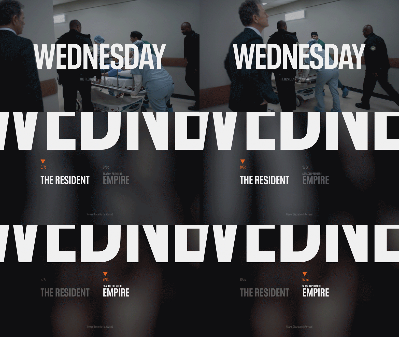
Typically, network packaging is a means to homogenize different programming into a cohesive experience for the viewer. Going into this process, my belief is that modern audiences engage with characters, stories and experiences - not being sold or marketed to.
Instead of homogeny, Our aim was to highlight, magnify and embrace what is different and unique to our stories. The Master FOX brand lives alongside the show brand - not overwrite it - and our navigational elements do the same. Whether it’s traveling seamlessly out of a shot - or through a bespoke block of typography - the goal was for navigation and tune-in to always be a neutral layer that guides and informs.


Marketing & Promotions
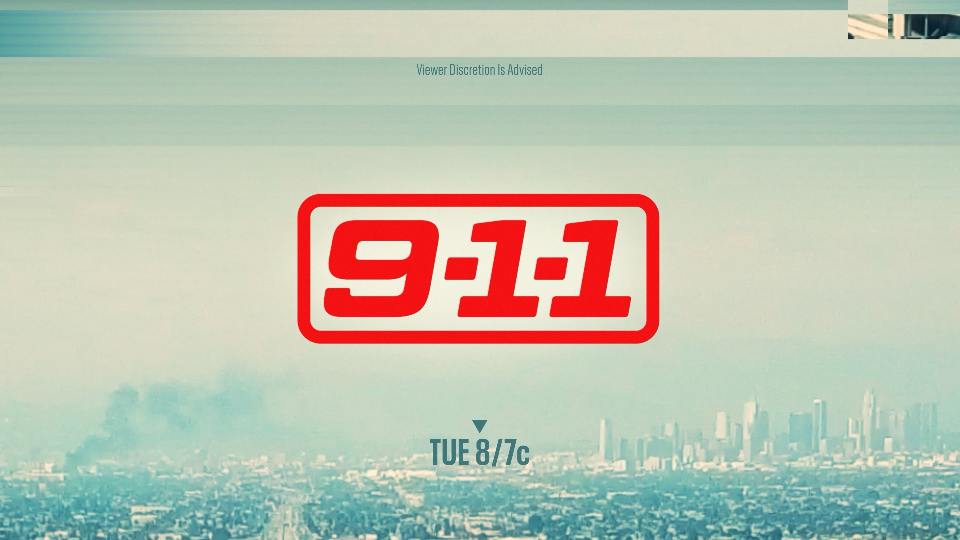
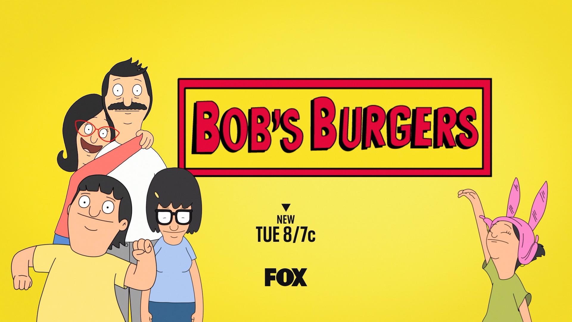
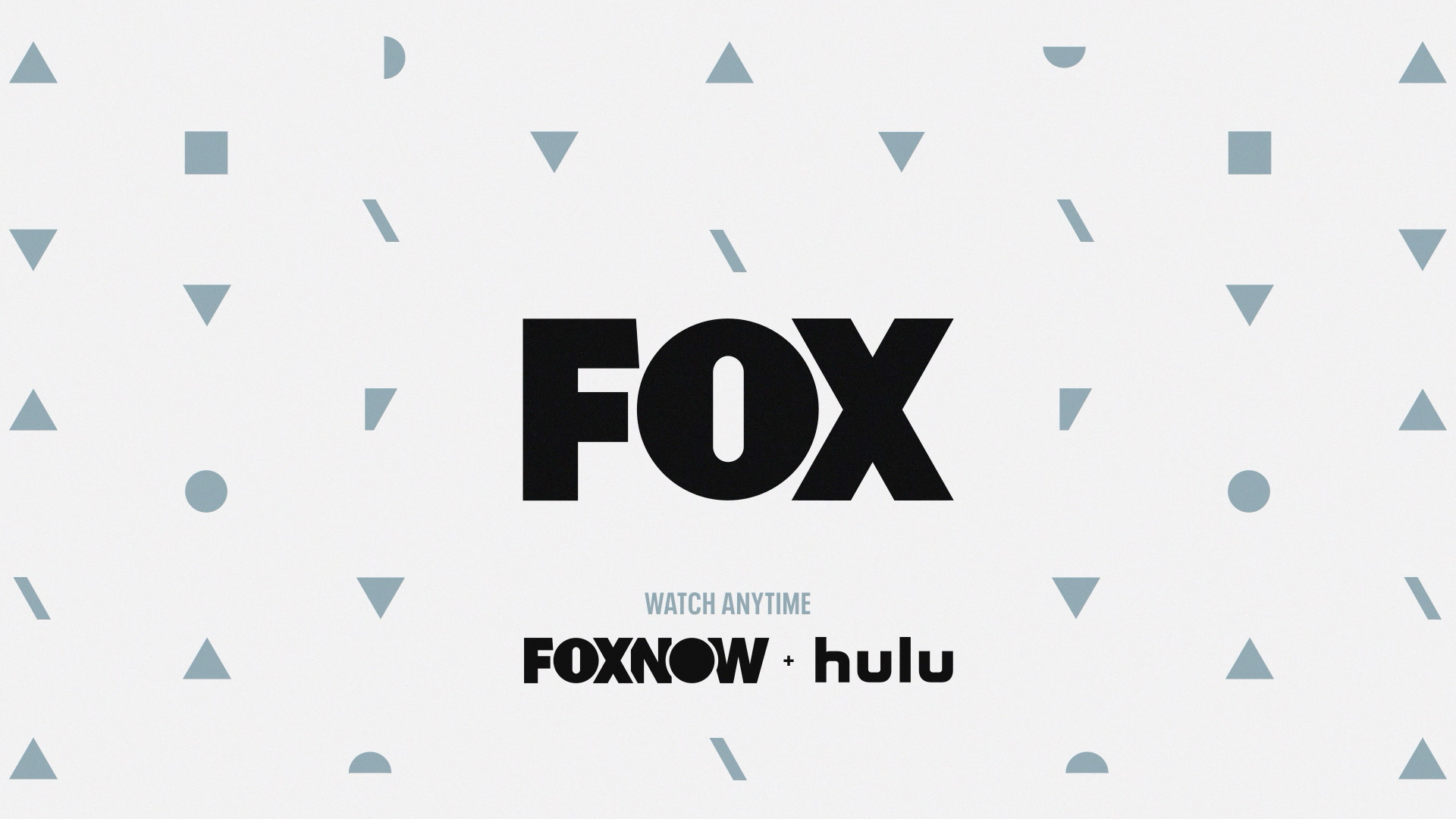
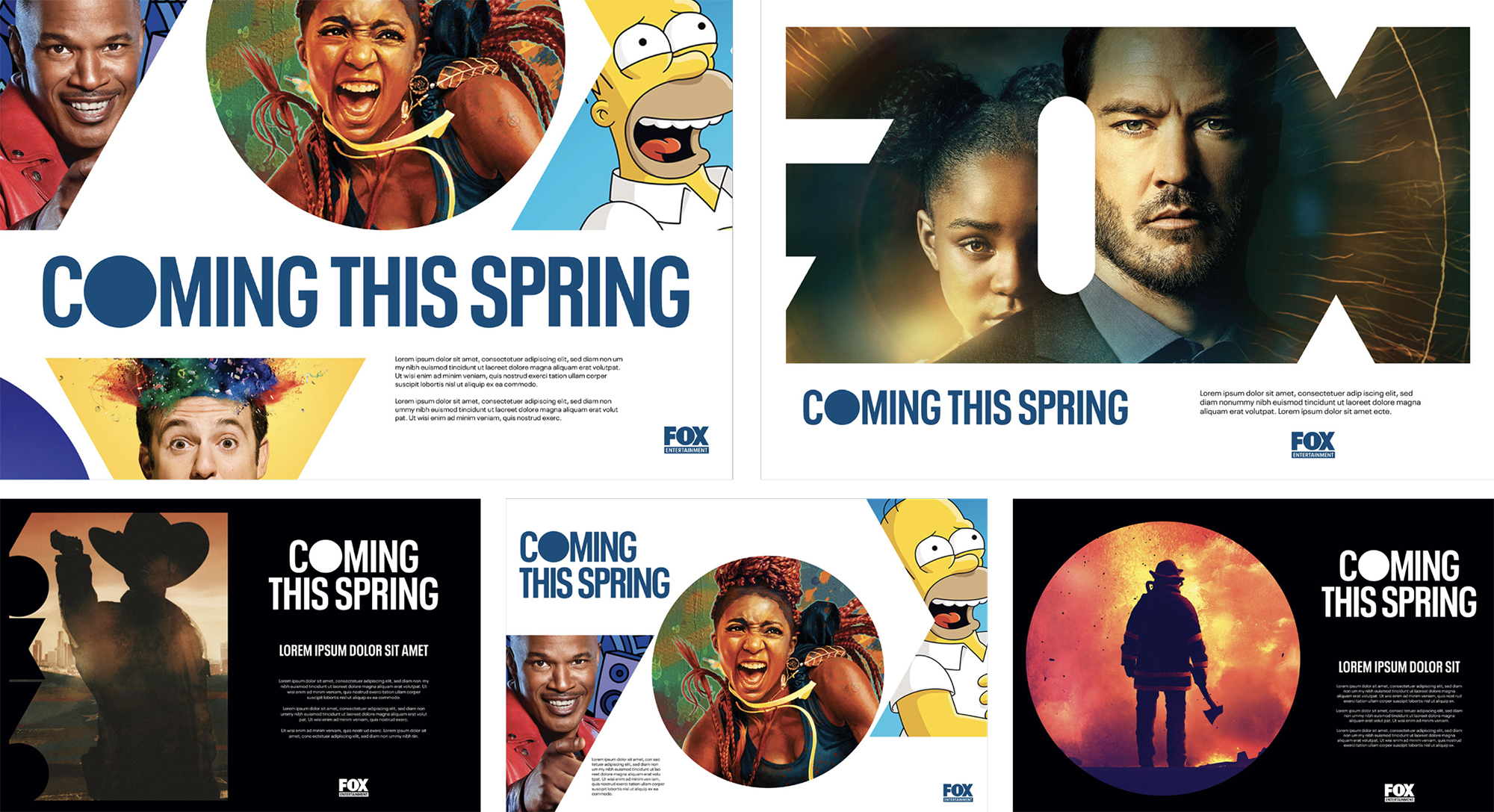
The new Brand Identity is being used extensively in consumer-facing materials across all media: Broadcast, Social/Digital platforms, The FOXNOW app and OOH.




Corporate Design Collateral
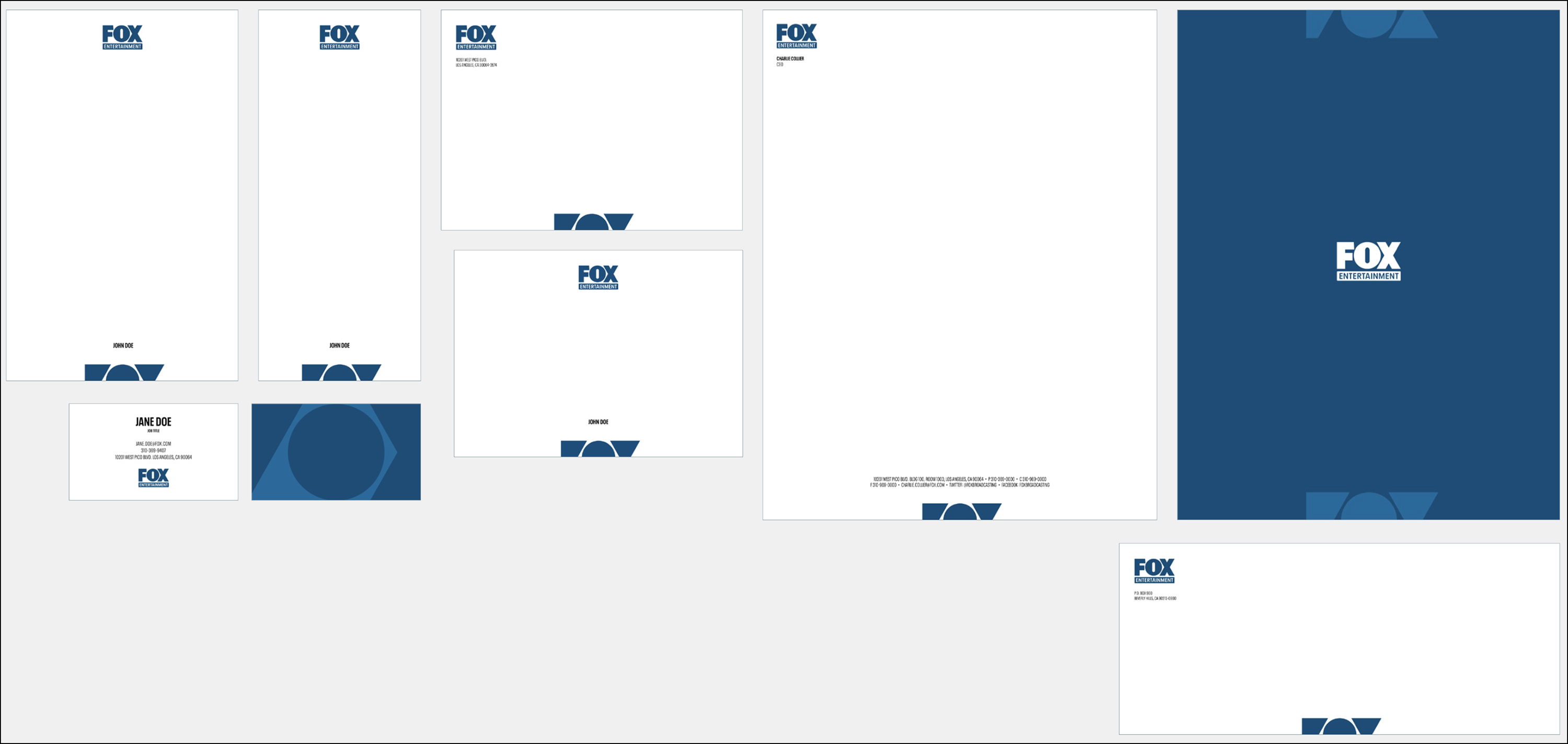
Below are some examples of the Design system at work across FOX Entertainment’s corporate footprint.


Thanks to everyone who helped to support
this vision.
this vision.
::FOX Credits ::
VP, Broadcast Design: Ian MacRitchie
Design Director: Jesse Hallas Director Of Operations: Jeff Hazan
VP, Broadcast Design: Ian MacRitchie
Design Director: Jesse Hallas Director Of Operations: Jeff Hazan
::Trollbäck+Company::
CCO: Alex Moulton
ECD: Erica Schrager
Sr Producer: Betsy Jones
ECD: Elliot Chaffer
Director, Strategy: Bo Bishop
CCO: Alex Moulton
ECD: Erica Schrager
Sr Producer: Betsy Jones
ECD: Elliot Chaffer
Director, Strategy: Bo Bishop
